Breaking
the Binary
A responsive website that challenges the use of gendered categories in order to give all shoppers the flexibility to choose items that fit their individual needs without the constructs of a gendered binary.
Sole UX Designer
Lead the responsive web design from conception to delivery, including research, ideation, user testing, prototyping, & UI design.
Timeline
Nov 2022-Feb 2023
/ PROBLEMThe use of rigid binary women/men categories found at the beginning of most online shopping experiences makes unnecessary assumptions about users’ wants and needs while also excluding entire communities from the beginning of the shopping experience.
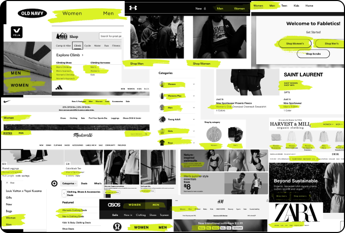
An overwhelming majority of online clothing websites rely on the use of a women/men binary categorical system to organize their inventory and guide online shoppers’ experience.
The use of women/men categories for online shopping relies on assumptions about the users which severely limits users’ ability to decide for themselves about what best fits their body and needs.
/ GOALCreate an inclusive online shopping experience that subtly shifts the use of categories to focus on guiding users to find the perfect fit for each individual’s body, taste, and needs.

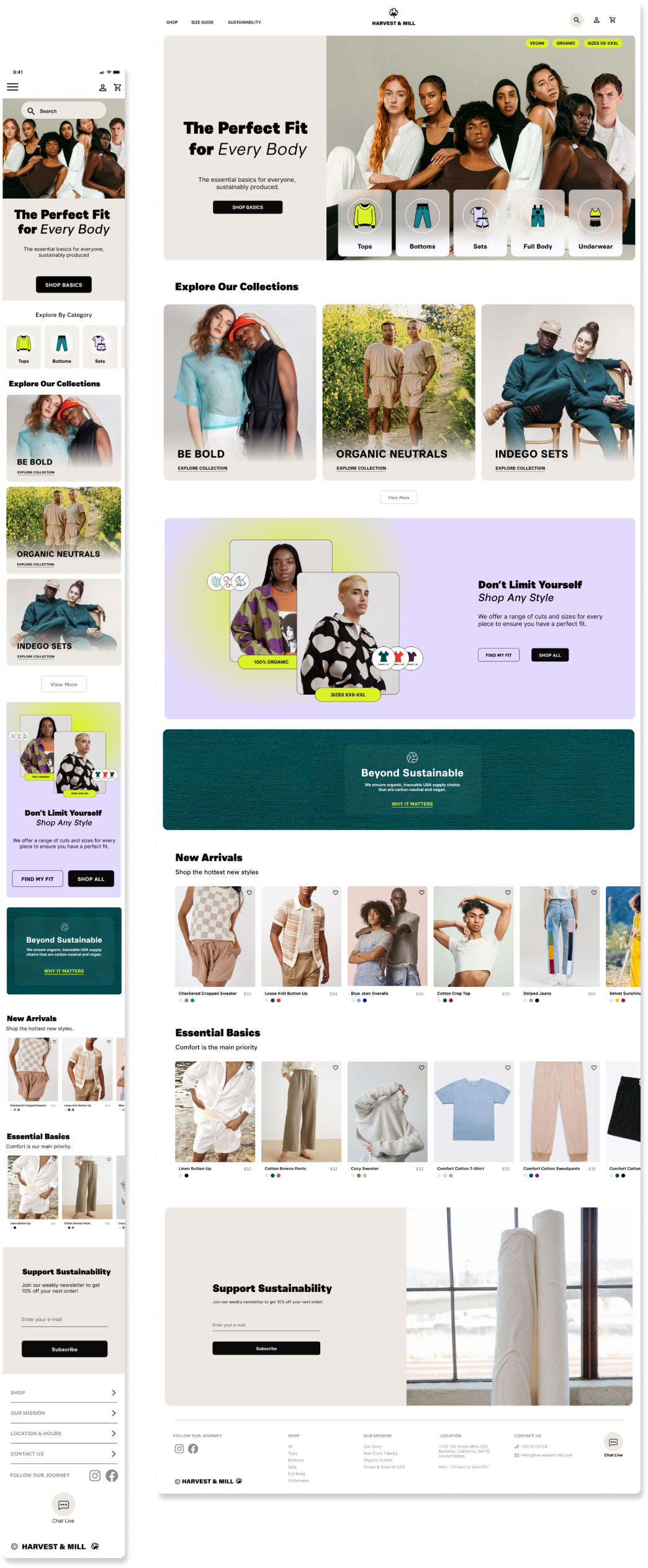
/ PRODUCT SOLUTIONA responsive website that gives the choice back to each individual shopper which enables users to choose clothing items based on their individual fit, style and needs.

Categories Focused on Form & Function
01 /
Removes gendered assumptions about what a person should or should not wear.
Maintains a systematic organization of inventory based on function and fit that translates to the overall site map.
02 /
Open Users’ Mindset on What is Possible
Direct call to action encouraging users to think beyond gendered expectations about what they should wear.
Maintains a systematic organization of inventory based on function and fit that translates to the overall site map.
03 /
Prioritize Inclusive Imagery
Take the guess work out of the subconscious process and show models of a wide range of identities wearing each clothing item.
Emphasize the clothing item more than the person wearing it to focus the attention on form and function.
Design Process
/OVERVIEWEmpathize
White Paper Research
Card Sorting & Interviews
Personas
Empathy Maps
User Journeys
Competitive Audit
Define
User Stories
Problem Statement
User Flow Studies
Site Map Exploration
Information Architecture
Ideate
Crazy Eights Brainstorming
Paper Wireframes
Digital Wireframes
Rapid User Testing
Prototype
Low Fidelity Prototypes
User Testing
High Fidelity Prototypes
Ui Design
Test
User Testing
A/B Testing
User Reflection Survey
Case Study Learnings
/ WHITE PAPER RESEARCHExplored over 50 online clothing stores shopping experiences
Found that an overwhelming majority required users to begin their search for a clothing item by first selecting either the men’s or women’s category.
Depending on what was selected, predetermined groupings were made based solely on assumptions about that gender’s needs.
Is the use of a binary men/women category system a valid assumption for companies to make and use as their core organization system?
Conducted 4 interviewss and had over 20 survey participants.
Individuals who shop online for clothing expressed that they found the current use of the men/women binary categories frustrating, stressful, and even alienating.
/ CARD SORTING RESEARCHIf users find the binary system of men/women groupings too broad of an assumptions about their individual needs and wants, how do they naturally sort and organize clothing items when given the chance to?
Conducted 6 card sorting exercises to better understand how users naturally group and associate different clothing items.
Users categorized clothing items based primarily on their function and use.
CLICK CARD SORTING IMAGES TO EXPAND
Key user needs identified through research:
01. Functional Categories
Users need organizational systems that prioritize a products function & use over gendered expectations of who will wear it.
02. Flexibility
Users want more flexibility and ease when selecting clothing items so that they can choose from all available items that could fit their needs without having to navigate between the men/women predetermined sections.
03. Inclusive Framework
Entire communities including queer, non-binary, transgender and gender fluid shoppers are left out of the men/women binary set up in most shopping experiences.
/ PERSONAS + EMPATHY MAPSIdentified Two Key User Groups:
Young, impressionable & often insecure high school to college students with ages 16-24, LGBTQIA+, specifically gender fluid, queer, non-binary who typically shop online for security and ease.
30-50, busy parents or professionals who need to shop online for convenience. Shopping for their family or themself with maturing style tastes, changing bodies and professional needs.
Understanding the Users
As a
young adult and emerging professional looking to express myself,
I want to
be able to find clothing that fits both my body and expresses my personality without the social constructs of gender,
So that
I can wear clothing that makes me feel confident and comfortable at work.
Problem Statement
Ada is a young professional who needs clothing that fits her body because she needs clothing that is comfortable and polished to make her feel confident at work.
If/Then Statement
If Ada is able to shop online for clothing without worrying about what gender the clothing is meant for, then they will be able to find outfits that fit their wants and needs and be confident in their clothing
/ USER JOURNEY MAPSCreating user journey maps with the personas helped identify opportunities for improvement by following the user’s happy path, highlighting edge cases, and exploring accessibility considerations
Identifying User Pain Points
User Pain Points Identified:
Difficulty understanding true fit and size due to lack of model representation or inclusive size & fit guides
Safety Issues or discomfort faced when shopping in both or the opposite gender category.
Wheelchair users facing limited clothing options that meet safety requirements for sitting close to wheels.
Limited time to try on and order new items if they do not fit as expected.
/ COMPETITIVE AUDITCompleted a competitive audit evaluating 6 companies that were direct and indirect competitors.
Compiled the results into a comprehensive report to analyze trends and insights
Discovered that there are very few clothing stores challenging the industry standard of categorizing clothing into a strict men/women binary and only a few companies that use an additional unisex category.
View Competitive Audit
/ JACOB’S UX LAW “Users spend most of their time on other sites. This means that users prefer a site to work the same way as all the other sites they already know.” -Laws of UX
Users have come to expect the men/women categories, so in order to remove an industry standard feature, the design solution must reframe the user expectations in a way that they allows them to not rely on this feature to shop.
/ WIREFRAMESRapidly Ideating Initial Design Solutions
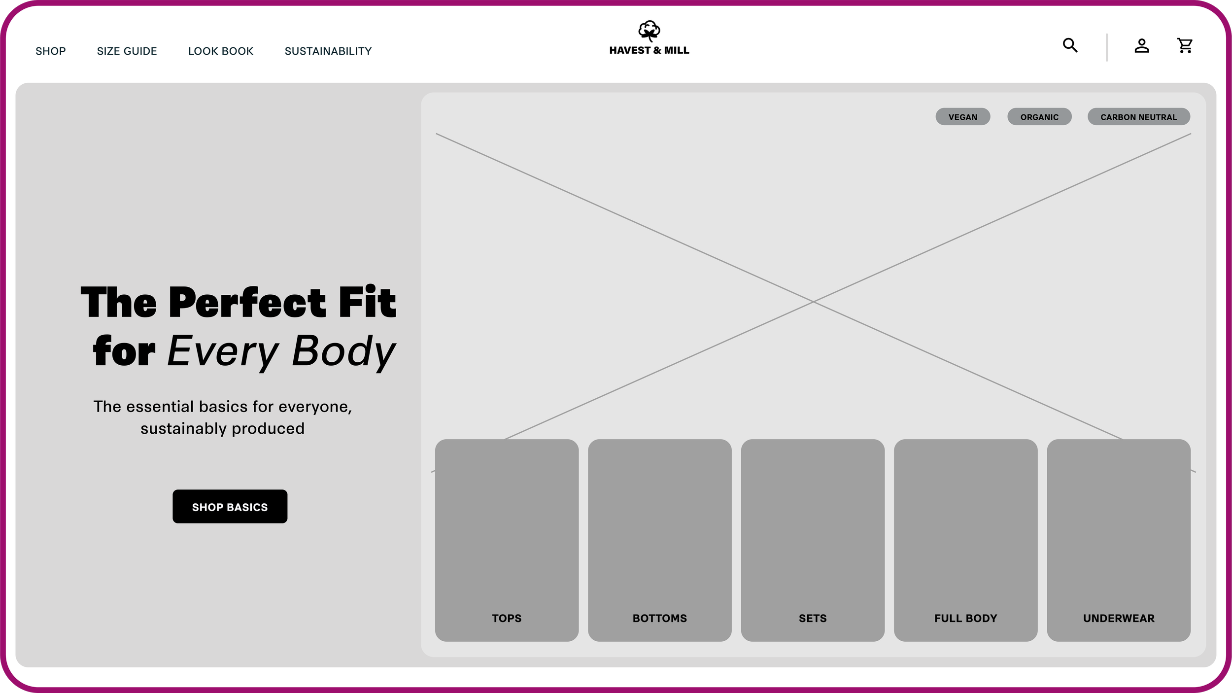
Developed initial site map to begin strategizing the most effective site structure.
Paper wireframes exploring possible solutions with minimal investment so that changes can quickly be incorporated.
Wireframes explore desktop to mobile layouts to ensure a flexible responsive layout.
/ RAPID USER TESTINGInitial moderated user testing with 3 participants revealed that the homepage did not clearly guide users to look beyond the men/women categories, thus not solving the core user pain point.
Developed two new homepage layouts to use an A/B testing method with users.
Users found option B more successful because the design guides users to begin their shopping experience by selecting a category based on the function of the item as the primary consideration while also minimizing other distractions.
Option A
Option B
/ HI-FI PROTOTYPEModerated usability tests with 3 participants .
Conducted post test survey.
3 key design updates based on user testing feedback:
01.
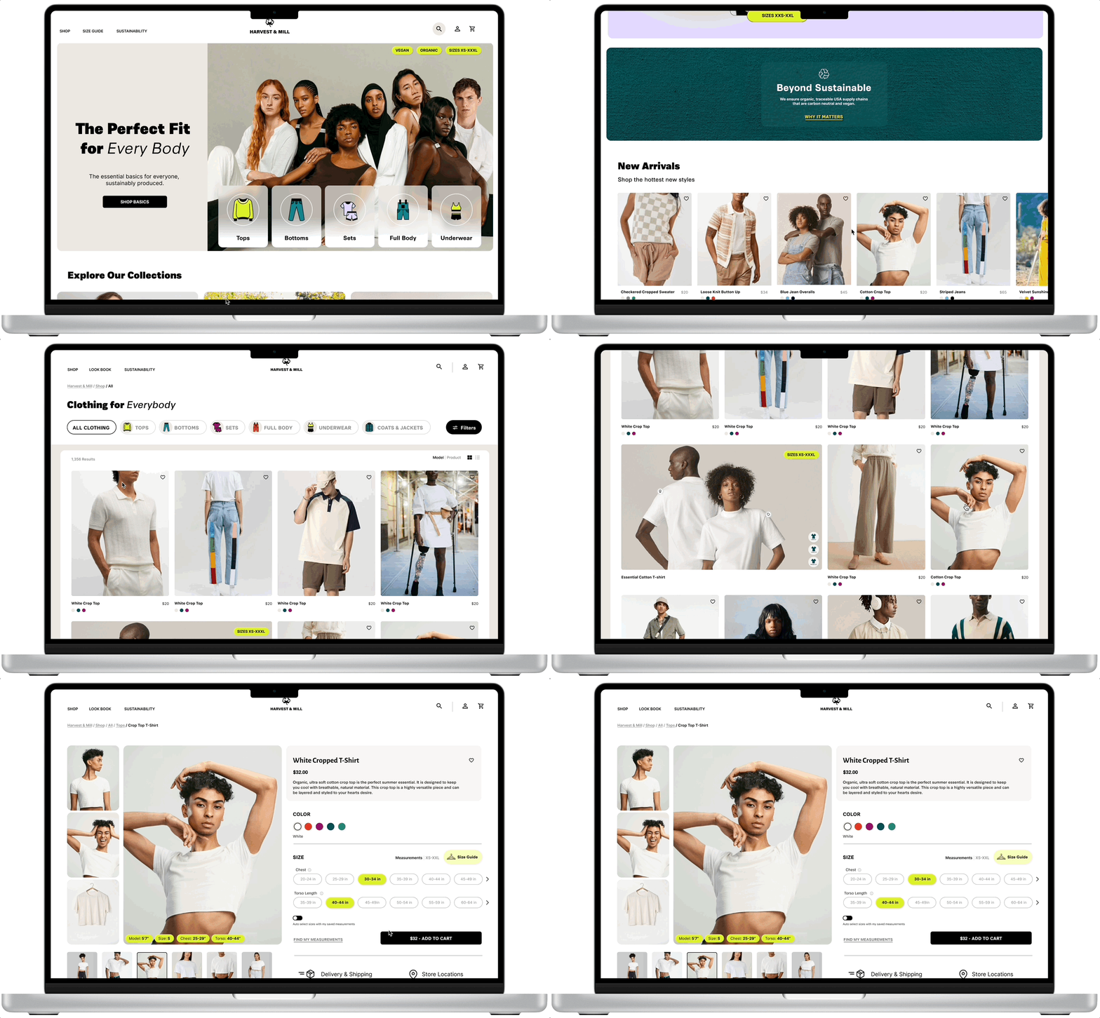
Providing the option to immediately shop or find their perfect fit while also highlighting the range of size and fits available to encourage users to shop based on their unique needs.
02.
Utilizing progressive disclosure of clothing filters to give shoppers maximum flexibility without overwhelming them with options.
03.
Include more comprehensive and inclusive product page that accurately depicts the true fit on a range of body types. Also added in flexibility to toggle between measurements and letter sizes for selecting the perfect fit.
Warm, earthy, welcoming design aesthetic paired with bold typography creates an inviting space for all shoppers to enjoy.
/ FINAL PRODUCT SOLUTIONPutting it all together.
/ RESPONSIVE LAYOUT DESIGN/ EVALUATIONThree Participants.
Unmoderated usability study using the Hi-Fi Prototype.
Post usability test questioner to collect user input
100% of participants responded that focusing on finding the perfect fit for their individual body positively impacted their shopping experience by making them feel included and in control to choose what items fit their needs and wants.
/ REFLECTIONS & LESSONS LEARNEDPrioritize the core user needs.
I learned that in order to solve for a complex user pain point, I need to focus on solving the most pressing issues first.
Trying to solve for too many issues at a time cluttered my approach and took a couple of tries before I streamlined my process.
Moving forward, I plan to go through the same exercise using an established e-commerce site instead of building one from scratch. This will allow me to continue to study and solve for a more inclusive shopping experience.
Test early and often to validate assumptions.
Understanding how a wide range of users perceive categories and filters allowed me to narrow down content on the home page and find the balance between usefulness and aesthetic.
/ NEXT STEPSExpand diversity of participants & continue user testing
Include a wider range of demographics to truly capture a more inclusive range of needs.
Explore solving pain point for established
Are there additional categories to the over arching form and function ones that should be included?
Explore how design solutions might need to change for different clothing industries.
Considering the wide range of clothing options available, new needs may arise and inform current design decisions.


