ACCESSIBLE PATHWAYS
FOR GOOGLE MAPS
/ PROJECT DETAILSPersonal Passion Project
ROLE:
Sole UX Designer
TIMELINE:
Oct-Dec 2023
TOOLS:
Figma + Figjam
/ PROBLEMGoogle Maps users have no way of evaluating whether a route is ADA accessible which severely limits users ability to safely navigate and explore.
/ GOALExpand existing accessibility features to include routes that are compliant with ADA incline guidelines and develop all supporting infographics.
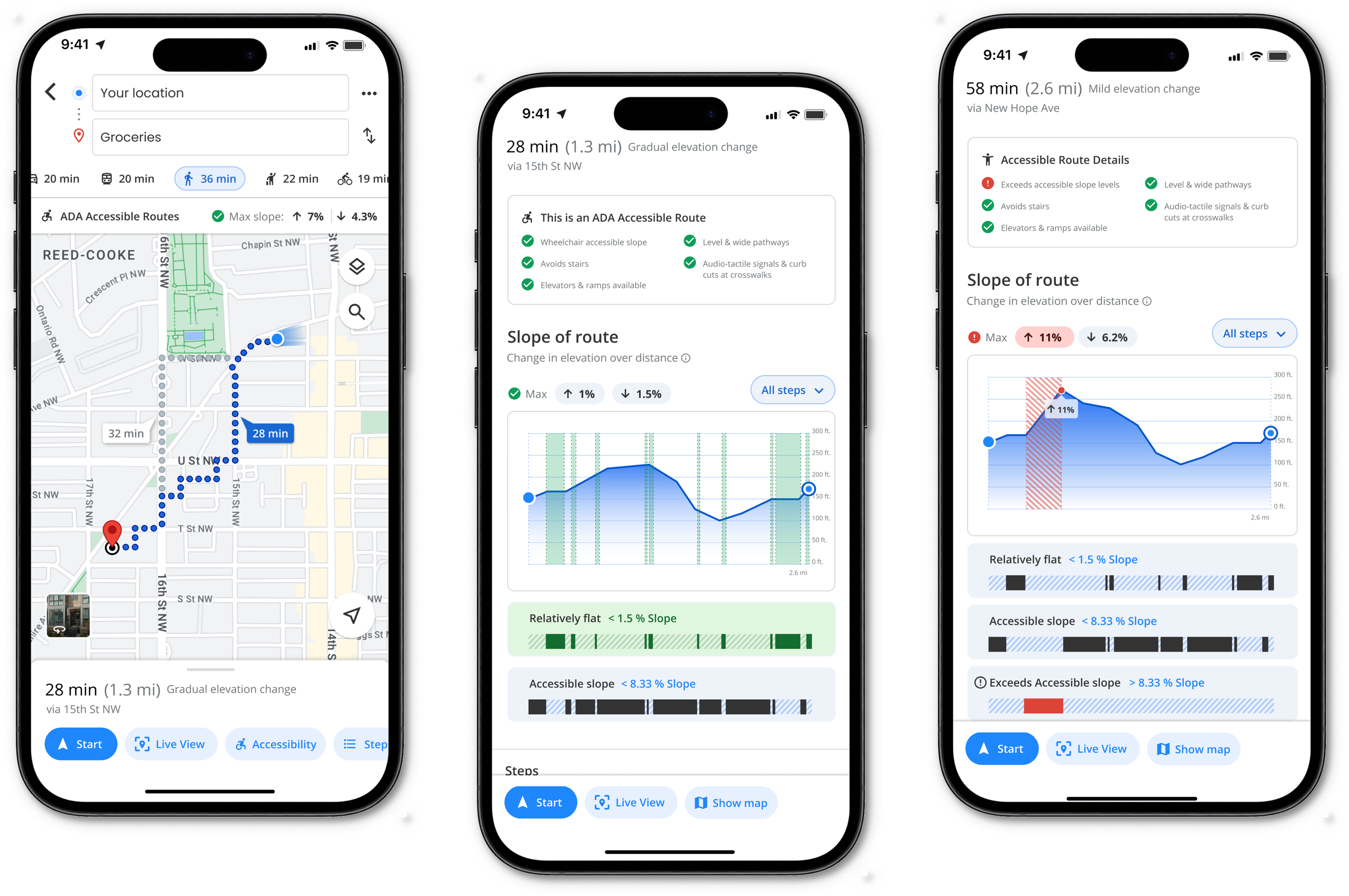
/ SOLUTIONAccessible Route Infographic
Interactive diagram highlighting change in elevation based on ADA guidelines.
Route overview with key accessibility considerations highlighted.
Change in elevation, or slope expands on distance included at each step.
/ PROJECT INTRODUCTIONWhy is this important?
In 2018, Google launched the wheelchair accessible routes in transit navigation feature for Google Maps in order to take mobility needs into consideration. This case study is an exploration expanding on this inclusive initiative which will benefits all users.
Reports show that Google Maps has over a billion users every month with 5 million active apps and websites using it as a core product. Because of this extensive reach, it is crucial that this product continues to evolve and meet users’ wide range of mobility needs.
Evaluating the current user experience of Google Maps’ accessible routes furthers Google’s mission for accessibility.
/ DESIGN PROCESSEvaluate
Existing accessibility features used in Google Maps & identify user needs.
Ideate
Design solutions incorporating
ADA accessibility regulations
& guidelines.
Test
Iteratively perform user testing to refine design solutions.
Identifying User Needs
User Needs
Google Maps users have a range of mobility needs that require them to consider a number of key factors in order to determine a safe and efficient route for themselves:
Level or paved pathways
Unobstructed and wide pathways
Curb cuts
ADA regulated change of elevation
Accessible cross walks
Stair and ramp options
/ USER STORIES, JOURNEYS, & USER FLOWSHighlighting pain points & observing how users interact with walking routes.
“As a young adult living in the big city alone, I need to find the safest route for me to be able to pick up my dinner when I am walking with crutches so that I can maintain my independence.”
“As a wheelchair user, I need to closely look at the trip details to see if there are any steep inclines or declines as well as stairs so that I can pick a route that is ADA accessible. ”
User journeys and flows highlight the need for additional accessibility details to be added to the route preview so that users can understand the specific accessibility accommodations that they can expect to help them evaluate whether a route is the right option for them.
/ EVALUATING GOOGLE MAPSAssessing Existing Accessibility Features
Highlighting key opportunities to improve or add accessibility features.
Additional user needs identified:
Accessible routes compliant with ADA regulations.
Integrated accessibility map layer, similar to bike routes overlay.
Clear, informative infographic detailing change in elevation.
Change in elevation between each step.
/ COMPETITIVE ANALYSISExisting product solutions lack providing ADA guidelines to users’ wide range of mobility needs in order to safely navigate on pedestrian routes.
The UK based app promotes health and wellness through daily walks and encourages quality time moving outside.
GoJauntly
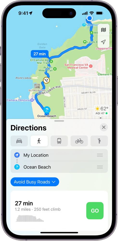
Route preview the most similar to Google Maps. Elevation change called out with minimal graph.
Apple Maps
“Know exactly how far and how high you'll travel with elevation profiles. Plan routes that match your goals.”
Footpath Route Planner
Citymapper
Accessibility features focused on step-free routes. Additional feature for night time safety.
Generating Ideas
/ PAPER & DIGITAL WIREFRAMESBrainstorming solutions to rapidly test with users.
User needs guiding ideation decisions:
Identify accessible slope
Explain what ADA guidelines say about accessible slope (change of elevation over a certain distance distance)
Identify when and how much elevation change is uphill versus downhill
Accessible cross walks
Type of path: paved, hard dirt, gravel
When and where elevation changes happen on route for distance and time
Elevator and ramp options
Shelter from elements (covered paths, indoor routes, etc.)
Brightly lit routes
Route maximizing nature
Only main routes, no back or side alleyways
Rough paper sketches, refined sketches, and lo-fi digital wireframes.
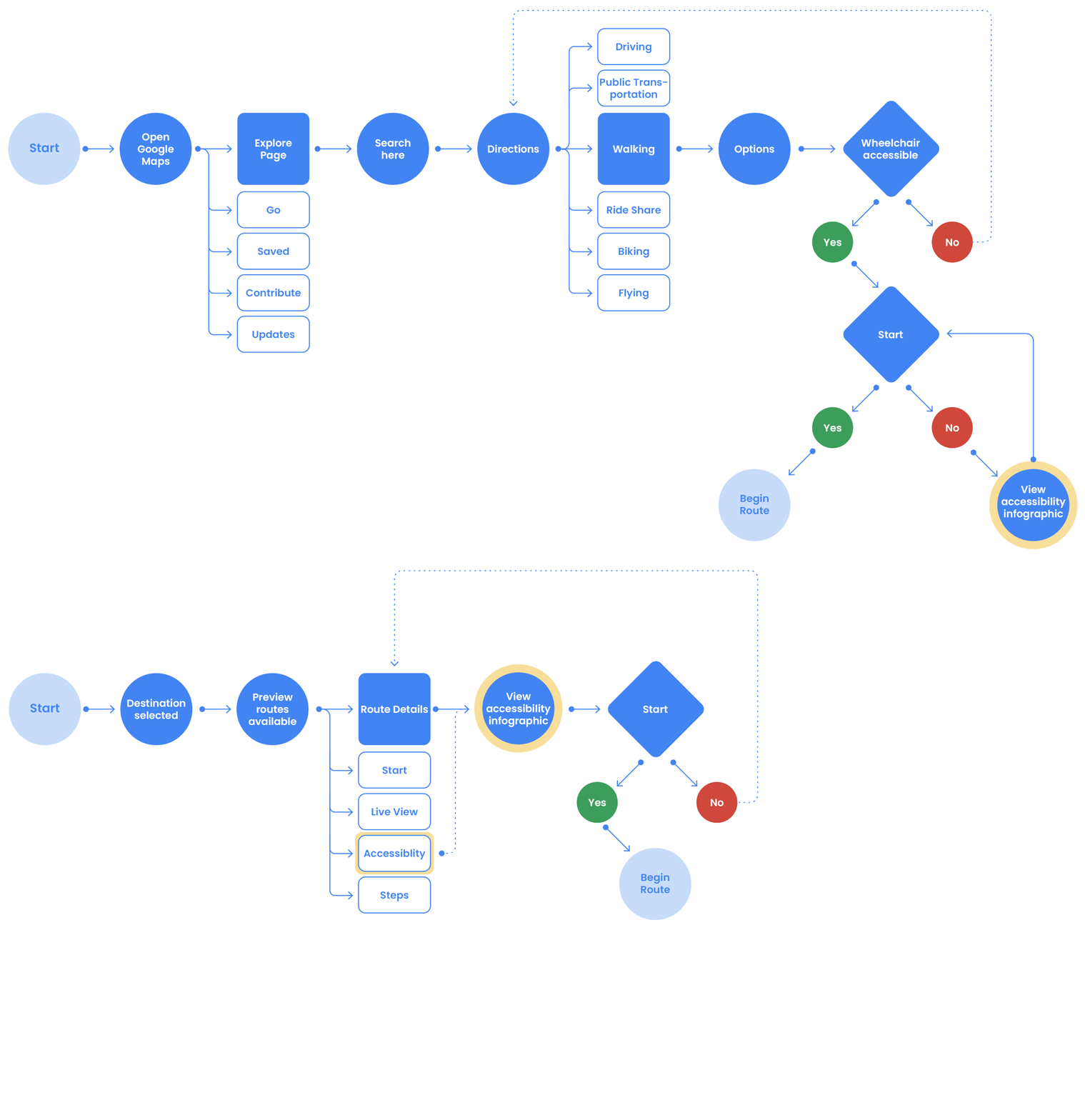
/ WIRE FLOWMapping where and how users interact with proposed design solutions.
Lo-fi digital wireframes used to quickly test assumptions about how to solve for user needs by asking 4 participants to walk through proposed user flow. These rapid studies revealed what ideas to move forward and which ones to revisit and keep brainstorming.
Incorporating User Feedback
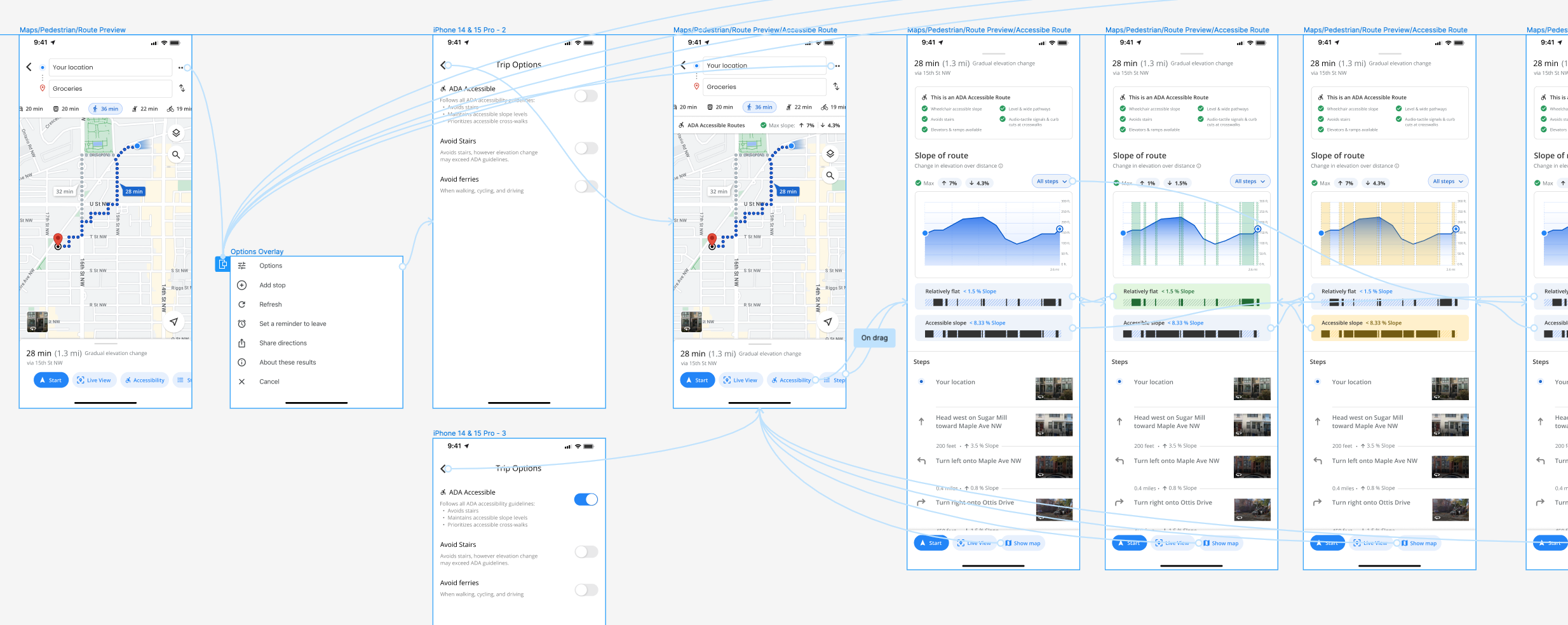
Created three viable Hi-Fi design solutions for the accessibility infographic to test with four participants in moderated usability studies.
4/4 users selected option A as the clearest overall display of information.
3/4 users found it useful to include information about the slope between each step.
4/4 users saw significant value in including the accessibility details at the beginning of the route overview.
2/4 users said “slope” needed to be explained in relationship to ADA guidelines somewhere.
/ HI-FI PROTOTYPE
6 users participated in a moderated usability study and said that the accessibility updates were significantly impactful, inclusive & usable.
“I always wonder when I pick a walking route, if there will be a really steep hill which would be hard with my bad knees. I think this would be so helpful!”
“Very clean, efficient, and fits into the Google aesthetic. I like the use of color plus a pattern to highlight key information in the diagrams.”
“Really cool! I could see myself using this when I travel .”
Putting it all together
/ SOLUTION
Expanded route details highlight accessibility considerations.
Interactive diagram highlighting change in elevation based on ADA guidelines.
Users can quickly scan route elevation and find the maximum slope to be expected.
Route overview with key accessibility considerations highlighted.
Change in elevation, or slope expands on distance included at each step.
Accessibility details for non-ADA compliant route options
Not all mobility needs are the same, so while some routes are not ADA accessible, they still benefit from having accessibility considerations detailed for the user.
Warnings clearly called out using a combination of change in color, pattern, and symbol along with
Written descriptions of what users should look for to better understand what accessible slope means for them.

Distilling complex information requires multiple rounds of refinement, testing, and pairing down.
/ REFLECTIONS & LESSONS LEARNEDProgressive disclosure is your best friend when walking user through complex information.
Clear, concise infographics are key. Only include the information that directly solves for the user needs.
Plan for additional rounds of testing for especially difficult features that could be solved by multiple different design directions. Embrace the rapid change of design solutions and do not get attached to one idea.
Find what is already successful in a product and distill & apply those principles to new solutions when designing new features.
Established products already have extensive user feedback, testing and buy in so build off of those design patterns and flows.
Attention to detail is critical when working in an established design system and looking to expand on it.
/ NEXT STEPSCreate the map overlay to further expand on how accessible pathways are communicated to users.
Guide users to select the right route for their needs.
Give them the ability to choose between a range of mobility considerations.
Explore how infographic overlays could be included in the navigation mode once the journey has begun


