Room Area Viewer Editor (RAVE)
Enabiling SmithGroup Employees to reduce their data classification process by 65%
Case Study
Client / SmithGroup
Project / Revit Plugin Software
Date / 2022, 6 months
Tools / XD, Figma, & Mural
Develop a product that improves employee workflow, visualizes spatial data, and creates central information hub.
Goal
Sole UX & Ui Designer
Role
1 Product Manager, 2 Developers, 2 Software Engineers, 1 UXR / SmithGroup’s Internal Technologies in Practice Studio
Team
Problem
Massive spacial usage datasets are left unclassified or difficult to find creating missed opportunity to utilize project data.
Solution
Established streamlined workflow through integrated data analysis tools that classify and record key project data firm wide.
Product Solution
Custom Room Area Viewer Editor product that seamlessly integrates into an architect’s daily workflow, allowing them to efficiently record, track, and analyze data.
Understanding the why
Role: Shadow UXR during research phases
Insights
SG employees need an efficient workflow and integrated data analysis tool in order to effectively record and utilize key spacial classification data.
Role: Lead UX Design
Connecting insights back to the human experience.
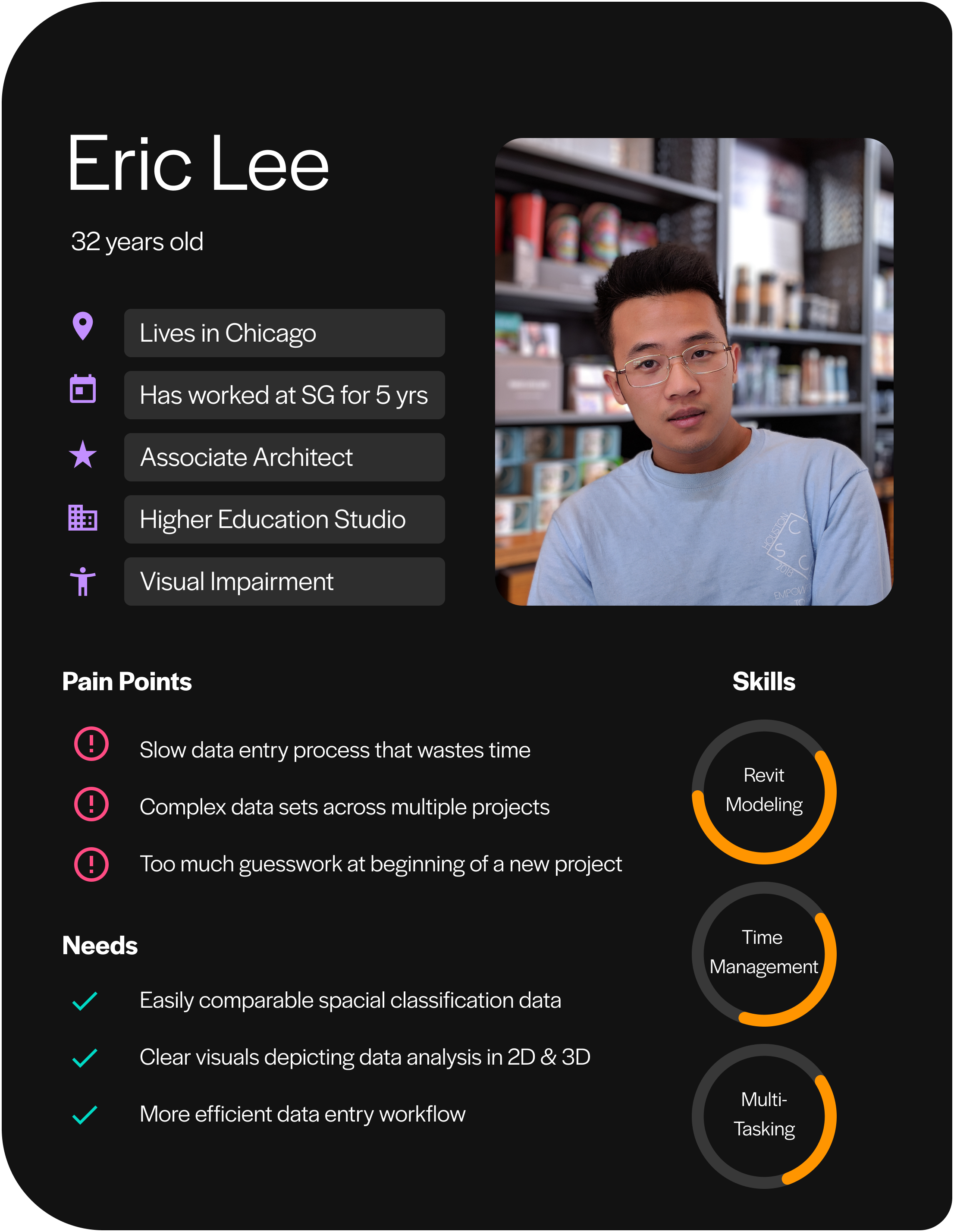
Personas
User Journeys
As a busy architect, Eric needs to be able to efficiently develop spacial massing plans so that he can balance his workload across multiple projects.
If Eric is able to quickly reference past project data,
Then he will be able to significantly reduce the amount of time creating a massing plan for new projects.
Establishing a framework for a new user workflow.
Reducing steps in process by 50%
Building the information architecture.
User Groups – Understanding the Internal Workflows
Interface structured by the type of action performed by the user.
Data Input
3D Visualization
Data Output
Close collaboration with the dev team to work within their technical limitations.
Lo-Fi Prototype
DESIGN UPDATE 01
Create distinct steps for users to follow when classifying project space.
Before
After
DESIGN UPDATE 02
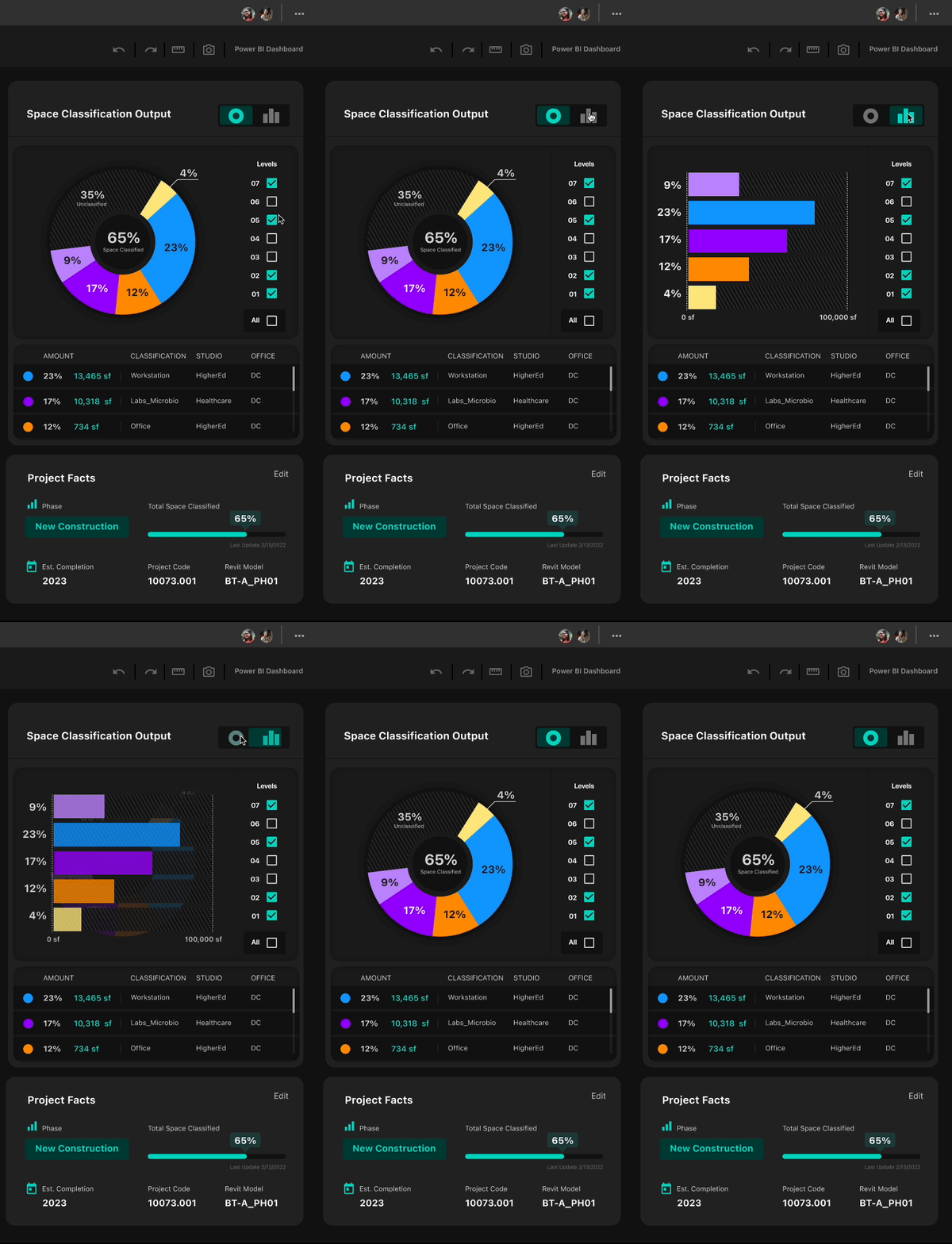
Clarify data analysis visuals and allow users to customize output method for their specific needs.
Before
After
DESIGN UPDATE 03
Make distinct tool bar for interactive levels tool in the 3D display panel.
Before
After
Logo Design
Ui Design
High contrast,
accessible color pairings
Components
Launching the MVP
Putting it all together
20
Participants
Continued testing with a focused group of 20 participants. Conducted unmoderated usability testing and collected insightful feedback through interviews and surveys.
Results
323 projects classified
Totaling 30,244,675 sqft classified to date
150+ users actively classifying project data
Utilized regularly by at least 32% of project teams
Lessons Learned
Successful implementation of design concepts requires constant conversations with the developers and software engineers.
Interface design must be flexible in order to work on a large range of screen sizes
Next step: Continue to explore optimizing responsive designs for the R.A.V.E. interface.
Progressive design guides users through a potentially complex task by chunking information or actions into achievable steps.
Next step: Further refine & test data visualization out put methods.


