Buddy
A Mobile app empowering youth navigating the foster care system to know their rights.
/ PROJECT DETAILSSole UX Designer
Led the app design from conception to delivery, including research, ideation, user testing, prototyping, & UI design.
SHINE AIGA Mentorship Program
Feb-May 2021 & Jan-Jun 2023
Personal Passion Project
/ PROBLEMYouth navigating the US foster care system are an at risk group suffering from severe trauma, depression, and loneliness.
There are over 470,000 youth currently in the US foster care system with an average of 250,000 kids entering the system a year.
The onset of the COVID-19 pandemic heightened already stressful and confusing circumstances that youth regularly face in foster homes by cutting off access to vital support systems and exacerbating already existing issues at their placement homes.
/ GOALEmpower kids in foster care to understand and exercise their rights by giving them the information, tools, and assistance necessary to navigate their new situation confidently and safely.
/ PRODUCT SOLUTIONA mobile app that helps kids in foster care understand and exercise their rights, connects them to local resources, and cultivates a stable community.
01 /
Learning Made Easy
Breaks down complex information into engaging age appropriate content.
Gamifies learning to capture their attention and peak their interests.
Simplifies search process by curating & suggesting content that fits their individual needs.
Connects the child to key support systems depending on their individual needs, circumstances, and location.
Provides direct access to professionals who are ready to help the foster kids with their different needs.
Clear, descriptive age appropriate categories, filters, and tags to simplify the search process.
Access to Local Resources
02 /
03 /
Connection to Stable Community
Creates a safe space for youth to share their experiences with peers navigating similar situations.
Encourages stable & reliable support systems for youth.
Cultivates friendly atmosphere through animal cartoon character guides and uplifting story recommendations.
Design Process
/OVERVIEWWhite Paper Research
Interviews
Personas
Empathy Maps
User Journeys
Competitive Audit
Crazy Eights Brainstorming
Paper Wireframes
Digital Wireframes
Rapid User Testing
Empathize
User Testing
A/B Testing
User Reflection Survey
Case Study Learnings
Define
Ideate
Prototype
User Stories
Problem Statement
User Flow Studies
Site Map Exploration
Information Architecture
Low Fidelity Prototypes
User Testing
High Fidelity Prototypes
Ui Design
Test
/ WHITE PAPER RESEARCH & INTERVIEWSResearched first person accounts from target user groups including young adults who have been in the foster care system, kids currently in a foster home, articles written by childcare experts, and reports documenting the US foster care system.
“Of the 470,000 youth currently in the US foster care system...90% of the children will experience severe trauma...with 25% attempting suicide.”
“They may not even know what their rights are as a child or how to advocate for themselves.”
“A lot of the times when youth are in foster care, [they] blame themselves for the problem…and when no one comes and actually talks to [them] about it, [they] continue to have that self-blame.”
“It is important for young people to find community and have adults that support them in their self-exploration of their identity.”
*Stats from childwelfare.gov & forothers.com
*Quotes from Revanfoundation.org, foster.wachildrenandfamilies.org , & fosterclub.com
/ AFFINITY DIAGRAMS & THEMESOrganizing & Analyzing the Data
Key Insights from Research
An overwhelming majority of youth in the foster care system need:
01.
02.
03.
04
Access to immediate help & longterm aid.
To be heard & able to express themselves in safe spaces.
A welcoming community & stable relationships.
To learn what rights they have & how to use them.
/ EMPATHY MAPS, PERSONAS & USER JOURNEYSAggregated empathy map created to better understand the users’ attitudes & behaviors.
Created personas created from the discovered characteristics of key user groups.
User journey maps developed for the personas highlighted opportunities for improvement by following the user’s happy path, highlighting edge cases, and exploring accessibility considerations.
Understanding the Users & Identifying Pain Points
/ PRODUCT SOLUTION IDEATIONExplored multiple product solutions to discover the best platform to solve user needs:
Video game for ipad
Wearable for easy emergency contact
App for mobile phone
Interactive board game
Audio head set for storytelling learning format
Flash card set with playful illustration to teach rights
After research, found that 42% of kids have phones by age 10, 72% by age 12, and 91% by age 14
The average amount of time spent on smart phones by US children ages 8-18 is roughly 2-3 hours daily
Identified that a mobile app would be the the most effective way to reach the target users.
*Stats from childmind.org & npr.org
/ COMPETITIVE AUDITCompleting a competitive audit highlighted a serious gap in the market for tools specifically designed for youth navigating the foster care system.
The majority of resources focus on helping the parents of foster youth or fundraising.
Lawfully app is a great reference for breaking down complex information for people navigating uncertain futures.
There is a significant lack of products focused on educating, guiding, or helping youth navigate the complexities of foster care.
/ INFORMATION ARCHITECTURE & SITE MAPDeveloping the Structure & Flow of the App
User flows built from user stories informed decision making to create a logical structure.
/ WIREFRAMESRapidly Ideating Initial Design Solutions
Paper Wireframes
Digital Wireframes
/ USABILITY TESTS WITH LO-FI PROTOTYPEEarly testing with 5 participants through moderated usability studies provided quick and essential feedback early on in ideation process.
Key updates informed by observations from user testing:
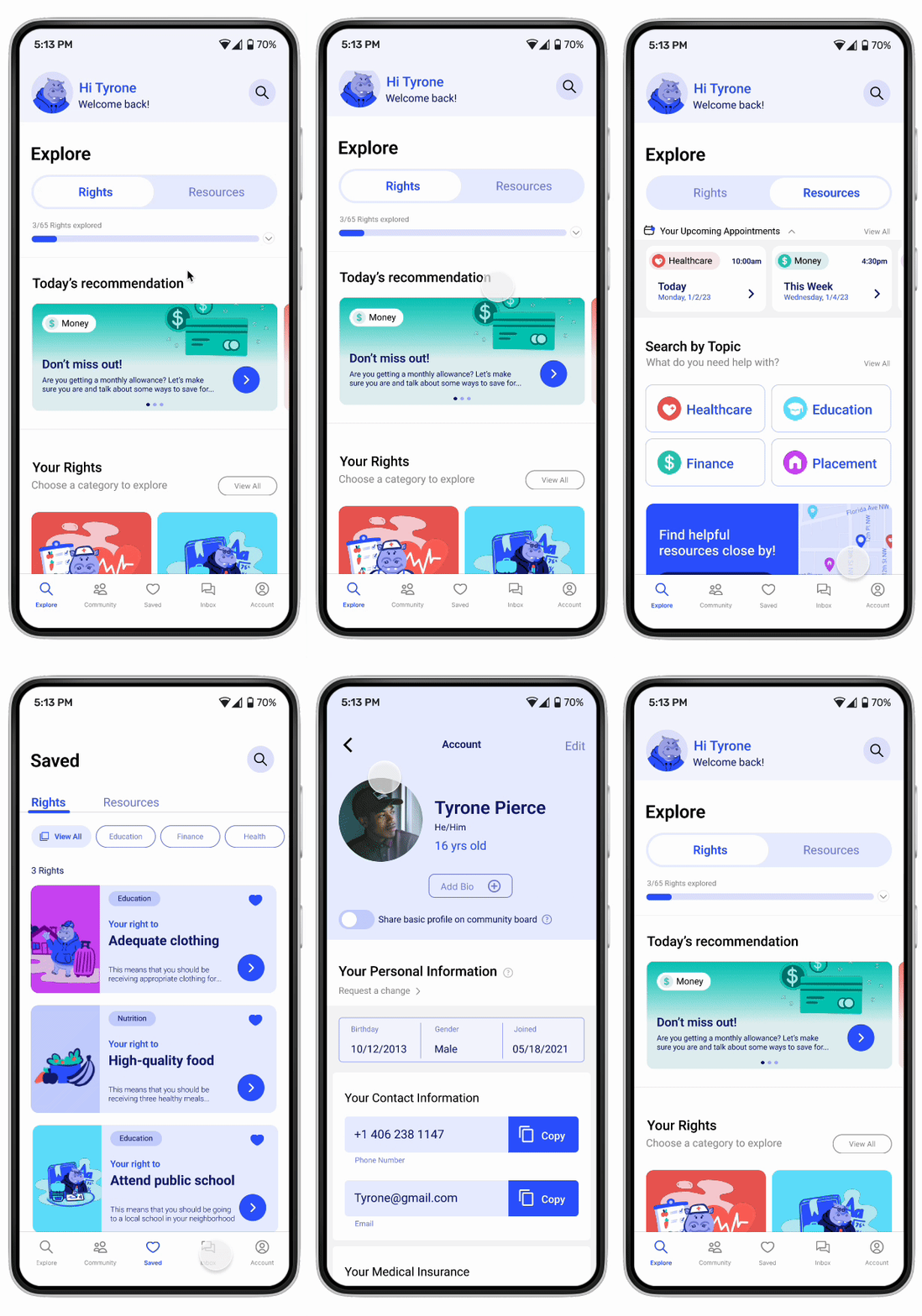
Prioritized Rights &Resources
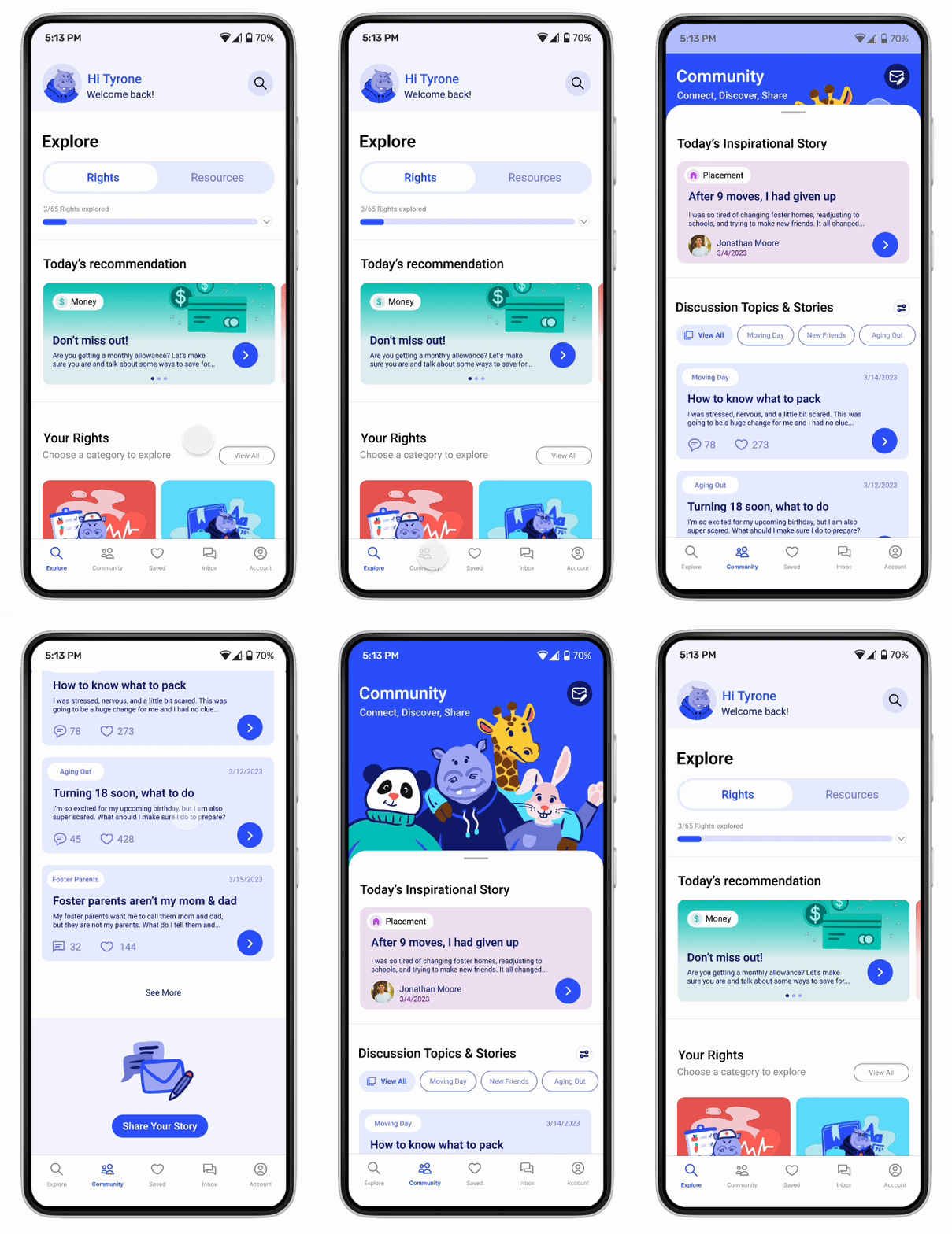
Emphasized the importance of Rights & Resources through the toggle button clearly centered on the top of the home screen.
Added recommended rights geared towards each kid’s personal needs & interests.
Modified the bottom nav bar to reflect the key features important to the kids needs. Moved the search bar to the top right to be consistent with other screens in user flows.
Simplified Categories & Grouping
Prioritized finding rights & resources by moving it to the home page.
Gamified the rights and resource categories to make it more engaging and memorable for kids.
Broke out key categories kids might find useful, but also provided an option to view everything at once.
Emphasized Community
Adjusted the layout to start with a welcoming graphic with Buddy the character guide hugging his friends as a sign of group support.
Moved the share your story action to the top right to separate it from specific discussion threads.
Provided recommend stories to catch the users interest and encourage them through relatable content.
Buddy
The Hippo Character Guide
Developed a friendly character guide to create an approachable yet strong figure who could provide consistent support.

/ USER INTERFACE DESIGNColor Palette
secondary
primary

components
/ HIGH FIDELITY PROTOTYPE/ EVALUATING DESIGN SOLUTIONModerated usability study using high-fidelity prototype with 5 participants
Post usability test questioner to collect user input
100% of participants felt that this app would have significant positive impacts aiding and supporting youth in foster care.
“Clean, straight forward, and easy to find important features.”
“Neutral and calming while also fun and playful. Information is approachable and not intimidating which is very reassuring to me.”
/ REFLECTIONS & LESSONS LEARNEDContinue asking “why” to push past initial assumptions and discover core user needs.
Initial research highlighted the need for kids to know their rights. I continued to ask “why” they needed this which allowed me to better empathize with the kids in foster care.
Asking “why” multiple times even when I thought I had found the user pain point pushed me to dig deeper which eventually highlighted deeper underlying needs such needing to feel in control of their own futures and empowerment to ask for what they need.
Reframing the problem statement helped me to think about new solutions instead of reworking existing products.
For example, instead of looking at how social workers can ensure that foster kids are receiving their basic needs, I asked how can this product help foster kids learn their rights and advocate for themselves.
Maximize effectiveness by prioritizing only key functions on the home screen.
The first design iterations overwhelmed and confused users with too many different features and functions available on the home screen. I refined the designs to only include features solving for core user needs.
/ NEXT STEPSTurn assumptions into tested data
Expand my user study groups to include first person accounts from children in the foster care system.
Refine the tone & voice
Develop UX writing that is age appropriate to the target audience of young adults and kids. This will further improve their engagement and comprehension.
Consider offline experience
Anticipate the likely reality that many if not most children who use this app will have unreliable wifi and limited data plans.
Thank you!


